Wednesday 15 December 2010

DRAFTS ON FILM POSTERS-FOR END SEQUENCES-ASH


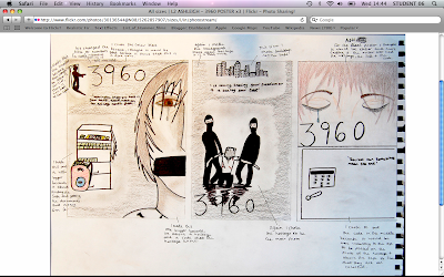
POSTER 1:
I thought i would be a good idea by having just one side of the hostage's face with some one with a gun and the safe with the money and the documents inside. I thought by doing this, this would be a good way to show what was happening in the film.

POSTER 2:
In the second idea i thought that it would just be good to just have the hostage in the poster because, having that in the middle f the poster means that its giving the idea of what is going to be happening in the film.

POSTER 3:
In the idea i thought, well it will be better if the poster was just on the hostage and the safe, so i put the hostage at the top and the safe at the bottom to show the order that they go in. They go in the order of hostage then safe. So i thought that, that would be a good i dea to just have them two on the poster.

Friday 10 December 2010

POSTER: 3

Batman: Christian Bale.
Christian Bale is in his batman outfit and is the only character on the poster to show that he is the main character and he is the hero.
The mood of the poster is dark and dangerous, and because Batman is the only one in the poster standing infront of a burning building is because that he is the only one that can save everyone and the poster is trying to get that across that batman can defeat evil.
The colour scheme of the poster is mostly black but with a hint of blue in it otherwise you wouldn't be able to see batman in his black costume.
The colours have been chosen because it is the dark knight and so the poster kind of gives you the visual sense of darkness.
The tag line is 'Welcome to a world without rules'
The films release date was July 18th.

POSTER: 2

Natalie Portman and Hugo Weaving are the main characters of the film so they have been put on the front of the poster.
They are presented by Hugo being the top person on the poster because he plays the main character that is about the film, and Natalie is underneath him because she is one of the main characters but not the one the film is about.
The design of the poster is red and black. Also the part of the poster where the title is, it has the extras in the poster as well when in the film they dress like the main character.
The colour scheme of the poster is red and black, the main character in black because of the clothes he wears in the film and because he will stand out more in the poster because of the red background. Natalie is in red but you can see her because she is outlined by black so that you can see her, but to show that she is one of the main characters but not the 'main' character. There is also a 'V' with a circle around it. This is in the colour of red and is also shown as blood because there is blood running from it.
The tag line is 'FREEDOM! FOREVER!'.
The poster has the release date of the film to come out, March 17th.

POSTER: 1


Bruce Willis is presented in the poster in two area's of the movie poster. He is at the top with just himself and a gun and this is the bigger photo of him in the poster, which shows that he is the main character in the movie. There is also another photo of him at the bottom holding a child trying to get away, with flames bursting from behind them.
The poster's design is dark and has fire in the background to get the sense that this film is so not a romance, its a action-triller.
The colour scheme of the poster is black and yellow (to show that there is fire).
The colours that have been chosen is to show that this is a dangerous/intense movie that contains a lot of fighting and explosions.
Th movie title stands out more because it is red and every thing else is black and yellow.
The text on the poster is easy to read because it is white and you can see it more clearly.
The title is red and bold and along the bottom of the title had a splat of blood in black s you can see it.
Under the poster title is a little catch phrase 'every second counts'.
On this poster there is no release date on it, but i think it means that they have not decided when the film will come out.

Tuesday 7 December 2010

STORY BOARDING


In the first scene, we have a hostage and captors wanting to know where there safe is and then when the hostage tells them where it is they kill the hostage. The idea is that the hostage works there and knows the safe or something along thoughs lines.
In the seconde scene we are following the robbers this time, to the safe and how they get it. They also have a little fight between the robbers and the securaty gards.


In the same scene, the robbers find the safe and open it and we have a reaction shot from them when they see what's in the safe. Also, in the scene one f the gards reach for the silent alarm and the robbers shoot him and then they realise they are alone and that they are running out of time.


In the end of the scene the robbers close the safe and then the audiance is in darkness and you hear a gun shot and one pair of footsteps running away, hearing police.


Wednesday 1 December 2010

MOOD BOARD-ACTION-THRILLER


There is one picture (the hostage) which we can bass our film around because you can do a lot of things and it gives you a lots of ideas to use. we will need some props to help set the scene and will be asking friends to cast as some of the captors and savers.
The mood board is what we are most likely going to do in the filming because i used some shot types that might help and that we might be able to recreate.

Tuesday 9 November 2010

GARAGE BAND-DIVSHARE


We were experimenting on Garage Band and and we have made a piece of music.
I thought that this piece of music was quite good as an experiment because, you have the beat,drums,tambourine and shakers. Also, I had to change some of the music because, it didn't work very well so I had to change it a few times. With this i was able to make a piece of music that fits quite well together and hopefully it will be good to other people when they listen to it.


Tuesday 2 November 2010

EDITING FOR THE PHONE CALL-THE MEETING PLACE


(Had to change character because our other actor was not present, also there are a continuity of mistakes where you maybe be able to see the script on the laptop and hat and bag in the fist shot. There is also another mistake where one of the clips are too short because of stoping the filming to soon.)

Monday 1 November 2010

THE PHONE CALL- THE MEETING PLACE EDITING


(Don't have all of the shots, so this is as far as we have got with it)

Friday 22 October 2010

THE PHONE CALL BLOG POST


Section 1: THE TASK &PLANNING

The task was to make and plan the phone call sequence.
we got given storyboards to draw on and write the script on them to know what we are doing and we are saying.we also got given shot lists and we had to do them in a particular order .i.e. instead of filming them from 1,2,3... we were told/shown to film the sequence 1,2,3,12,4,8,5...

Section 2: FILMING & EDITING

The filming was not done in the right order,but when it is put on final cut the we can make sure that we do put it in the right order. The film was not shot in narrative sequence because, it is easier to film one charactor doing there part of the phone call and then filming the other charactor doing his/her part of the phone call and then in final cut putting them in the right order so it seems that there are two different cameras on two different people but are having the conversation.
I helped film and direct so to give different opinions and advise to how this/that particular shot.
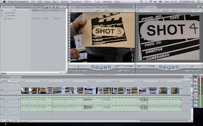
The clapperboards helped name the shots so it was easier and quicker to put them in the right order in final cut for the editing.
Cutting on movement means, that when a charactor is ,for example, turning a door handle you will cut on the door when it is open just a little bite/or when a charactor walks up a hall and to a door you will cut on the moment when that charactor puts his/her hand on the door handle, that is when you take another shot when you are in the room, you take the shot of the charactor then coming into the room, and on editing to make it look like that it is the same action but it looks like that it has not been interrupted.
I have learnt that with the editing process, is that it makeis it so much easier to have clapperboards to help tell you what shot this is so you van put it in order and also nameing the by there shot names because in the editing part you take out the clapperboards and just have the film,so it also helps have the name there as well.
Wednesday 20 October 2010

'Match on action' && '180 degree rule'


A match on action, a technique used in film editing, is a cut that connects two different views of the same action at the same moment in the movement. By carefully matching the movement across the two shots, filmmakers make it seem that the motion continues uninterrupted. For a real match on action, the action should begin in the first shot and end in the second shot.

One simple principle when shooting subjects is considering 'the line' known as the 180-degree rule. For some filmmakers and / or videographers this may come naturally, but this is a major principle, no mater the degree of experience or knowledge, that every camera operator needs to all ways consider; otherwise is or her work will appear amateurish.

Sunday 17 October 2010

Turning people into Zombies with James Ward


James Ward, National Film School of Ireland.
Model Making and Production, Design for Film and Television.

Before James does anything else to turn someone into a zombie, he puts a bald cap on their head to protect them from getting anything (plasticine) on their hair, then he puts on polyvinyl gloves to protect his hands from getting dirty. He attaches the bald cap to the head with contact glue that he puts on the rim of the bald cap and on the skin so that it stays where it is.

Then after that, he puts in two types of silicon (life form, skin safe), one blue and one grey, and mixes them together,and then once they have been mixed well, James puts the silicon on the face of the person he is changing. James puts this on the skin first so that it will just come off when dry.

Once the silicon is all on, James then puts plasticine all over it, till the face is completely covered to harden the form of the mask (leaving the nose holes open so the person can breathe).

Once that is done, to get all off the person has to puff up his cheeks and wriggle his eyebrows to release the mask from his face.

Once the mask is off, James then had to use a (silver-free wax clay, soft), to plug up the nose holes so the plaster won't come out of it.

For the plaster, James had to mix water with plaster powder to form the mixture, once that has been made he then lines the mask with a little of the plaster to get the fine details (which is called crystal cal) and then he fills the rest of it with the rest of the plaster.


Tuesday 12 October 2010

Target Audiance Member


I like most of these pitchers and thats why I'm heading towards the younger generation in there teens,maybe younger or little older. For example, I like to read Sugar and Vogue, I Watch the Vampire Diaries etc.
I thought that these Pictures would help indicate that this is for the younger generation because, I have put on most of the things that a teen would want/have/will get when older.


Thursday 7 October 2010

Find your tribe

www.findyourtribe.co.uk
Ceated by C4 by research agencies crowd DNA and voodoo.
You are a Townie! Your job might be a bit boring but it brings home the bacon and helps you save up for those two weeks away to Spain. Your weekends are set in stone – trip to the shops in town, buy yourself something nice, head to the All Bar One with friends, have a laff, maybe go for a club, as long as there’s none of the indie weirdo music. Keep it straight, you say.

When i got the results i didn't know what to think, but now i think about it, it completly describes me for the things that i like. Being called a townie is quite funny because i love to go shopping and going out to watch a movie at the cinema with my friends.

Our class results are:
Clubbers: 1
Townis: 2
Rahs: 1
Chaus: 1
Blingers: 1
DIYers: 1
Skaters: 1
Indie kids: 1
Scene kids: 1
Sports Junkie: 1


Sunday 26 September 2010

Blog homework


L2 IDENT ASHLEIGH from cmdiploma on Vimeo

-The most difficult thing about working with Photoshop was how to get all of the layers that you needed for my logo,and then making the colours work in a 'fire' like way. How I resolved this was to use a different technique, instead of making my logo look like fire I made look as if on fire still but looking also as if it's going very fast.

-The most difficult thing about working in Final Cut, was taking everything that was on Photoshop and putting it on Final Cut and getting it in the order that I needed it to be in to make my logo again.

I learnt that how to make it easier to get them in the right order was to save them separately in Photoshop and naming them 1,2,3... and then to make it work on Final Cut was to put them on top of each other in a line.

-Well, I am pleased that I was able to keep the look of the fire, and it looks good when fading into view, because it is simple and not over the top.

Thursday 23 September 2010

ADVERTISING (Commercials/Posters/Leaflets/websits)


http://www.google.co.uk


Both of these (the poster and the website)
are entertaining and social events, the target audience is for all ages.

ELECTRONIC MEDIA (Videogames/Mobil Phones/Websites)


http://www.google.co.uk


With these devises you can go any where with them because they are either on you phone, or they are that your house and they entertain you, i would have thought that their target audience would be teens and over.

PRINT (Newspapers/Magazines/Books)


http://www.google.co.uk


http://www.google.co.uk


I thought that these were the best ones to choose because, there target audience is teens and i read both of them. They both make the younger genaration read, one to fine out whats happening to there favorite celebrity and, two they can read bout something that interests them,in their fantasies etc.

VISUAL (Photography/Art)


http://www.google.co.uk


http://www.google.co.uk


Van Gogh was a great artist, But he suffered from mental illness and cut off one of his ears,because he thought he could her voices in his head, after suffering from the illness through his life. On 27 July 1890,aged 37, he walked into a filed and shot himself in the chest but survived the impact and managed to walk back to the Ravoux inn. he died there two days later.

Wednesday 22 September 2010

AUDIO/VISUAL: MEDIA PRODUCT


Realest: 19th September 2010.


Alesha Dixon was in the band Mis-Teeq but the band broke up and so Alesha became a solo artist and did her first album in 2006.


AUDIO MEDIA PRODUCT: KISS FM RADIO STATION


Official Website: http://www.totalkiss.com/

Kiss FM: own: Kiss Network, Bauer Radio, 6th September 2006 first came on air.
Bauer media group owns the German Empire cinema magazine.